Projects today are becoming more complex, involving multiple teams, tight deadlines, and constantly evolving requirements. Without a clear system to manage tasks, workflows, and timelines, projects can quickly become disorganized and inefficient. This is where project management charts play a crucial role.
These charts convert complex project data into simple visual formats, making it easier for teams to understand, plan, and execute tasks effectively. Instead of relying on long documents or endless meetings, charts provide instant clarity and actionable insights.
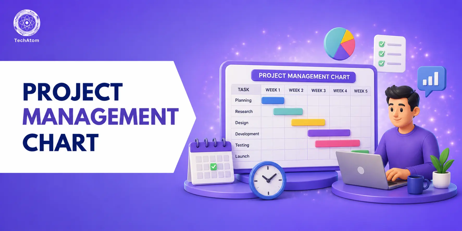
In this guide, you’ll explore 15 essential project management charts along with their explanations, use cases, pros, and cons. Whether you’re a beginner or an experienced project manager, this guide will help you choose the right chart for your needs.
What Is a Project Management Chart?
A project management chart is a visual representation of project data that helps teams plan, organize, track, and analyze their work. These charts can display timelines, workflows, dependencies, performance metrics, and resource allocation in a clear and structured format.
Different charts serve different purposes. Some focus on planning, such as Gantt charts and WBS, while others help with execution, like Kanban boards. There are also charts designed for reporting and analysis, such as bar charts and Pareto charts.
By using these charts, teams can better understand project scope, identify potential risks, and make informed decisions. They act as a bridge between complex data and practical execution, making project management more efficient and transparent.
15 Essential Project Management Charts
1. Gantt Chart
A Gantt chart is a timeline-based visualization that displays project tasks along a horizontal time axis. Each task is represented as a bar, showing start and end dates, duration, and dependencies between tasks. It allows project managers to see how different activities overlap and how delays in one task can impact the entire project.
Modern Gantt charts are interactive and can be updated in real time, making them highly dynamic. They also highlight key milestones and deadlines, helping teams stay aligned. This chart is widely used in complex projects where coordination and scheduling are critical. Overall, it provides a complete overview of project progress and structure.
Best for
Gantt charts are best suited for large and complex projects that involve multiple tasks, dependencies, and strict deadlines. They are commonly used in industries like construction, IT, and product development where precise scheduling is essential. Teams that need a clear visual timeline and coordination across multiple phases will benefit the most from this chart.
Pros
- Complete project visibility
- Strong dependency tracking
- Helps with scheduling and planning
- Supports milestone tracking
Cons
- Can become complex and cluttered
- Time-consuming to create
- Requires accurate and updated data
2. Work Breakdown Structure (WBS)
A Work Breakdown Structure (WBS) divides a project into smaller, manageable components arranged in a hierarchical format. It begins with the main project objective and breaks it down into phases, tasks, and subtasks. This structured approach helps teams clearly understand the full scope of work involved.
By organizing tasks into logical groups, it ensures nothing is missed during planning. WBS focuses on “what needs to be done” rather than “when it will be done.” It is typically created at the beginning of a project to establish clarity. This chart is essential for organizing complex projects into simpler parts.
Best for
WBS is best for projects that require detailed planning and clear structure before execution begins. It is widely used in engineering, construction, and product development projects where breaking down tasks is critical. Teams that struggle with understanding project scope or missing tasks will find WBS especially useful.
Pros
- Clear task organization
- Improves understanding of project scope
- Prevents overlooked tasks
- Easy to interpret
Cons
- Does not show timelines
- Cannot display dependencies
- Limited use during execution
3. Kanban Board
A Kanban board is a visual workflow management tool that displays tasks as cards moving through different stages such as To Do, In Progress, and Done. It helps teams manage work in real time and provides instant visibility into task status. This system focuses on continuous delivery and workflow efficiency rather than strict timelines.
Teams can easily identify bottlenecks by seeing where tasks are getting stuck. Kanban boards are highly flexible and can be customized based on team needs. They are widely used in agile environments for ongoing work. The simplicity of the board makes it easy for teams to adopt and use effectively.
Best for
Kanban boards are best suited for agile teams and projects that involve continuous workflows rather than fixed deadlines. They are commonly used in content creation, software development, and design teams. Organizations that prioritize flexibility, real-time updates, and workflow visibility will benefit the most from this chart.
Pros
- Easy to use and implement
- Real-time workflow tracking
- Improves visibility of tasks
- Helps reduce bottlenecks
Cons
- No timeline representation
- Limited dependency tracking
- Not ideal for large, complex projects
4. PERT Chart
A PERT chart (Program Evaluation and Review Technique) is used to map project tasks and their dependencies using nodes and arrows. It focuses on analyzing different sequences of tasks to estimate the overall project duration. This chart is particularly useful when dealing with uncertain timelines or complex workflows.
It helps teams understand task relationships and identify the most efficient path to completion. PERT charts also highlight tasks that can run in parallel. By visualizing dependencies clearly, teams can allocate resources more effectively. It is widely used in planning large and uncertain projects.
Best for
PERT charts are best for projects that involve uncertainty, multiple dependencies, and complex scheduling requirements. They are commonly used in research, engineering, and large-scale planning projects. Teams that need to estimate timelines accurately and manage interdependent tasks will benefit greatly from this chart.
Pros:
- Strong dependency visualization
- Helps estimate project timelines
- Identifies critical and parallel tasks
- Useful for complex planning
Cons:
- Complex to create and manage
- Requires assumptions and estimates
- Not beginner-friendly
5. Flowchart
A flowchart is a diagram that represents a process using symbols and arrows to show the sequence of steps and decisions. It helps teams visualize workflows in a clear and structured manner. Flowcharts are widely used for process mapping, decision-making, and system design.
They simplify complex workflows into easy-to-understand visuals. Teams can quickly identify inefficiencies, redundancies, or bottlenecks in a process. This chart is highly flexible and can be adapted for different use cases. It is one of the most commonly used tools for improving processes.
Best for
Flowcharts are best for visualizing processes, workflows, and decision-making paths. They are widely used in operations, business processes, and system design. Teams that need to simplify complex workflows or identify inefficiencies will find flowcharts extremely valuable.
Pros
- Easy to understand and use
- Clearly shows workflow steps
- Helps identify bottlenecks
- Flexible for multiple uses
Cons
- Not suitable for large projects
- Does not show timelines
- Can become cluttered with complexity
6. Critical Path Method (CPM)
The Critical Path Method (CPM) identifies the longest sequence of dependent tasks that determines the total duration of a project. These tasks are considered “critical” because any delay in them directly affects the project deadline. CPM helps project managers prioritize tasks that must be completed on time.
It is often used alongside other tools like Gantt charts for better visualization. This method ensures efficient scheduling and resource allocation. It also helps identify tasks that have flexibility (non-critical tasks). CPM is essential for time-sensitive projects.
Best for
CPM is best suited for projects where meeting deadlines is critical and delays are costly. It is commonly used in construction, engineering, and infrastructure projects. Teams that need to prioritize tasks and manage time efficiently will benefit the most from this method.
Pros
- Identifies critical tasks clearly
- Improves time management
- Helps prevent project delays
- Enhances scheduling efficiency
Cons
- Requires accurate data
- Can be complex to understand
- Less flexible for changing projects
7. Network Diagram
A network diagram visually represents the sequence of tasks and their relationships using nodes and connecting arrows. It provides a structured view of how tasks are linked and the order in which they must be completed. This chart helps project managers understand dependencies and workflow structure.
It is useful for identifying critical paths and scheduling tasks efficiently. Network diagrams also help in resource allocation and planning. They are often used in combination with CPM or PERT charts. This makes them valuable for complex project planning.
Best for
Network diagrams are best for projects that require detailed scheduling and clear visualization of task relationships. They are commonly used in IT projects, operations, and system planning. Teams that need to understand task sequences and dependencies in detail will benefit from this chart.
Pros
- Clear visualization of task relationships
- Helps with scheduling and planning
- Supports dependency tracking
- Useful for complex workflows
Cons
- Can be complex for large projects
- Requires time to create
- Difficult to update frequently
8. Pareto Chart
A Pareto chart is a combination of a bar graph and a line graph used to identify the most significant factors affecting a project. It is based on the 80/20 principle, which states that 80% of problems come from 20% of causes. The chart ranks issues from most impactful to least impactful, helping teams focus on what matters most.
It is widely used in quality management and problem-solving. By highlighting key issues, it enables better decision-making. Teams can prioritize efforts and resources effectively using this chart.
Best for
Pareto charts are best for teams that need to prioritize tasks or identify the most impactful problems. They are widely used in quality control, operations, and performance improvement projects. Organizations looking to focus on high-impact areas with limited resources will benefit the most from this chart.
Pros
- Helps prioritize important issues
- Supports data-driven decisions
- Easy to create and understand
- Highlights high-impact areas
Cons
- Limited to specific use cases
- Requires accurate data
- May oversimplify complex problems
9. Fishbone Diagram (Cause and Effect)
A Fishbone Diagram, also known as a cause-and-effect or Ishikawa diagram, is used to identify the root causes of a problem. The main issue is placed at the “head” of the diagram, while potential causes branch out like bones. These causes are usually grouped into categories such as people, process, equipment, and materials. This structured approach helps teams analyze problems systematically instead of guessing. It is commonly used during brainstorming sessions to uncover hidden issues. By breaking down contributing factors, teams can focus on solving the actual problem rather than symptoms.
Best for
This chart is best suited for teams dealing with recurring issues, quality problems, or process inefficiencies. It works particularly well in industries like manufacturing, software development, and operations where identifying root causes is critical. Teams that need structured brainstorming and deeper analysis will benefit the most from this chart, especially when solving complex or unclear problems.
Pros
- Identifies root causes effectively
- Encourages team collaboration
- Simple and structured format
- Improves problem-solving
Cons
- Does not provide direct solutions
- Can be subjective
- Limited to problem analysis
10. RACI Chart
A RACI chart is a responsibility assignment matrix that defines roles in a project. It categorizes team members into Responsible, Accountable, Consulted, and Informed for each task. This ensures that everyone knows exactly what they are expected to do. It eliminates confusion and prevents duplication of work.
RACI charts are especially useful in large teams where responsibilities can overlap. By clarifying ownership, it improves accountability and communication. It also helps stakeholders stay aligned throughout the project lifecycle.
Best for
RACI charts are ideal for projects involving multiple stakeholders, departments, or teams. They are particularly useful in corporate environments, consulting projects, and large-scale initiatives where role confusion can cause delays. Teams that struggle with accountability or communication gaps will benefit significantly from implementing this chart.
Pros
- Clear role definition
- Reduces confusion
- Improves accountability
- Enhances team coordination
Cons
- Time-consuming to set up
- Needs regular updates
- Not useful for tracking progress
11. Project Timeline
A project timeline is a simple visual tool that maps tasks, milestones, and deadlines over time. Unlike complex charts, it provides a straightforward overview of the project schedule. It helps teams understand what needs to be done and when. Timelines are often used in presentations to communicate plans to stakeholders.
They are easy to create and update, making them ideal for quick planning. While they lack advanced features like dependencies, they are highly effective for maintaining clarity. They also help align team members with project goals.
Best for
Project timelines are best suited for small to medium-sized projects where simplicity is more important than detailed tracking. They are ideal for marketing campaigns, event planning, and short-term projects. Teams that need a quick overview without complex dependencies will find timelines extremely useful.
Pros
- Simple and easy to create
- Clear visualization of deadlines
- Good for communication
- Quick to update
Cons
- Limited detail
- No dependency tracking
- Not suitable for complex projects
12. Bar Chart
A bar chart is a basic yet powerful tool used to represent data visually using rectangular bars. Each bar corresponds to a category or variable, making it easy to compare values. In project management, bar charts are often used to track metrics like cost, time, or task completion.
They simplify complex data into an easy-to-understand format. This makes them useful for reporting and presentations. Teams can quickly identify trends, patterns, or performance gaps. Despite their simplicity, they remain one of the most widely used charts.
Best for
Bar charts are best used for reporting and comparing project metrics in a simple format. They are ideal for presentations, stakeholder updates, and performance tracking. Teams that need quick insights without complex visuals will benefit the most from this chart type.
Pros
- Easy to understand
- Simple to create
- Great for comparisons
- Widely used
Cons
- Limited depth
- Focuses on one data type
- Not suitable for complex analysis
13. Pie Chart
A pie chart represents data as slices of a circle, showing how different parts contribute to a whole. It is commonly used to visualize percentages and proportions. In project management, pie charts help track resource allocation, budget distribution, or task completion ratios.
They provide quick insights into which areas consume the most resources. This makes them useful for decision-making and reporting. However, they work best when there are limited categories. Too many segments can make the chart difficult to interpret.
Best for
Pie charts are best suited for visualizing proportions such as budget allocation, resource usage, or time distribution. They are commonly used in reporting and stakeholder presentations where quick understanding is important. Teams that need to show percentage breakdowns will find them highly effective.
Pros
- Simple and visually appealing
- Easy to understand
- Great for percentage data
- Effective for presentations
Cons
- Not suitable for large datasets
- Hard to compare many categories
- Limited analytical depth
14. Burndown Chart
A burndown chart is commonly used in agile project management to track remaining work over time. It shows how much work is left compared to the project timeline or sprint duration. The chart typically includes an ideal progress line and an actual progress line. This helps teams understand whether they are ahead or behind schedule.
It is updated regularly to reflect real-time progress. Burndown charts are especially useful for sprint planning and tracking. They also help teams stay focused and motivated.
Best for
Burndown charts are best suited for agile teams working in sprints, such as software development or product teams. They are ideal for tracking short-term progress and ensuring deadlines are met. Teams that need continuous performance monitoring will benefit the most from this chart.
Pros
- Clear progress tracking
- Easy to update
- Motivates teams
- Supports agile workflows
Cons
- Limited task-level detail
- Not suitable for complex projects
- Requires frequent updates
15. Control Chart
A control chart is used to monitor process performance over time and identify variations. It includes upper and lower control limits that define acceptable performance ranges. Any data point outside these limits indicates a potential issue. This helps teams detect inconsistencies early and take corrective action.
Control charts are widely used in quality management and process improvement. They provide a data-driven approach to maintaining consistency. By identifying trends and anomalies, teams can improve efficiency and reduce errors.
Best for
Control charts are best suited for quality control, manufacturing, and process-driven industries where consistency is critical. They are useful for teams that need to monitor performance over time and detect anomalies quickly. Organizations focused on continuous improvement will find this chart highly valuable.
Pros
- Detects variations and anomalies
- Supports quality improvement
- Provides real-time insights
- Data-driven decision making
Cons
- Does not identify root causes
- Requires accurate data
- Can be complex to interpret
What to Look for in a Project Management Chart
Not all charts are suitable for every project. Choosing the right one depends on your goals, team size, and project complexity. A good project management chart should simplify information rather than complicate it.
Here are the key factors to consider:
- Does it clearly represent your project data?
- Can your team easily understand and use it?
- Does it support collaboration and decision-making?
- Is it flexible enough to adapt to changes?
The best chart is not the most complex one, but the one that provides the most value for your specific project needs.
Provides Insight Into the Project Scope
One of the biggest advantages of project management charts is their ability to provide a clear overview of the entire project scope. Instead of looking at scattered tasks or isolated activities, charts allow you to see how everything fits together.
For example, charts like Gantt and WBS help visualize the full structure of a project, including tasks, phases, and deliverables. This makes it easier to understand the amount of work involved and how different components are connected.
By having a clear view of the project scope, teams can avoid missing tasks, manage resources more effectively, and plan more accurately. It also helps stakeholders understand the project at a glance without needing detailed explanations.
Improves Your Efficiency, Regardless of Team Size
Project management charts significantly improve efficiency by turning complex data into easy-to-understand visuals. Whether you are working with a small team or managing a large organization, clarity is essential for productivity.
Without visual tools, teams often spend a lot of time discussing tasks, timelines, and responsibilities. Charts eliminate this confusion by presenting all information in one place. Team members can quickly understand what needs to be done and when.
This leads to faster decision-making, reduced miscommunication, and better time management. Even a simple chart can save hours of discussion and improve overall workflow efficiency.
Helps Team Members Collaborate and Provides Better Transparency
Collaboration is a key factor in project success, and project management charts play a major role in improving it. These charts clearly show who is responsible for each task, what stage the project is in, and how tasks are connected.
This level of transparency ensures that everyone on the team is aligned and aware of their responsibilities. It reduces confusion, prevents duplicate work, and makes it easier to identify who to approach for support.
Additionally, transparency increases accountability. When team members can see progress and responsibilities clearly, they are more likely to stay on track and meet deadlines. This creates a more organized and collaborative work environment.
How to Choose the Right Project Management Chart
Choosing the right chart depends on your project goals and workflow:
- Use Gantt Chart for timelines and dependencies
- Use Kanban Board for workflow tracking
- Use WBS for planning and structuring tasks
- Use Fishbone Diagram for problem-solving
- Use Burndown Chart for agile sprint tracking
- Use Bar or Pie Chart for reporting and analysis
Selecting the right chart ensures better clarity, improved efficiency, and successful project execution.
Common Mistakes to Avoid When Using Project Charts
- Using overly complex charts for simple projects
- Not updating charts regularly
- Choosing the wrong chart type
- Ignoring team training and understanding
- Overloading charts with too much information
Avoiding these mistakes will help you get the most value out of your project management charts.
Final Thoughts
Project management charts are essential tools that simplify complex workflows and improve team productivity. By using the right chart at the right time, you can enhance planning, execution, and reporting.
Start with simple charts and gradually move to advanced ones as your projects grow in complexity. The key is to focus on clarity, usability, and consistency.
When used correctly, these charts not only improve efficiency but also ensure better collaboration and project success.
Frequently Asked Questions
1. What is a project management chart?
A project management chart is a visual tool used to plan, organize, and track project tasks, timelines, and workflows. It helps teams understand project progress and make better decisions.
2. Which project management chart is best for beginners?
Kanban boards and project timelines are best for beginners because they are simple, visual, and easy to understand without complex dependencies.
3. Why are project management charts important?
They are important because they improve clarity, enhance team collaboration, track progress, and help complete projects on time with better efficiency.
4. What is the most commonly used project management chart?
The Gantt chart is the most commonly used because it clearly shows tasks, timelines, and dependencies in a structured visual format.
5. Can project management charts improve productivity?
Yes, they improve productivity by reducing confusion, improving task tracking, and helping teams focus on priorities and deadlines more effectively.
People are also reading: