We visit multiple websites every day for various purposes, such as online shopping, gaining knowledge, etc. When we visit any website, we perform certain actions. For instance, if we visit an eCommerce website, we search for the desired products, add a few products to a cart, and finally buy them.
While we perform all these actions, we are interacting with the website, and all this is possible because of the user interface of that website. We visit different types of websites, and they have diverse user interfaces.
But what is the user interface exactly? A user interface is a part through which users can interact with a website or application. It is a feature of any device or application through which users can interact with it. It helps visitors to know about the services or products a particular web application or website provides. The user interface components or elements are the color, fonts, layout, menu, buttons, and many others.
Having a good user interface plays a crucial role in converting visitors into customers. This is because the UI is the only aspect that facilitates communication between visitors and your web application or website.
The UI is the first thing visitors notice when they visit a website. So, having a clean, appealing, and easy-to-navigate user interface attracts visitors and engages them for more time on your website.
In this blog post, we shall walk you through the top 10 cheat codes for designing user interfaces that draw visitors' attention. Prior to it, let us understand why it is important to have a good UI design.
So, let us get started without further ado!
Why is a Good User Interface (UI) Important?
The following are the top 5 reasons why a good user interface is important:
1. Acquiring New Customers
A good quality user interface contributes to providing a positive user experience. The high-quality UI design, in conjunction with the UX design strategies, helps you attract and engage more visitors to your website.
However, there are many designers out there who are trying to reach out to and attract the same target audience you do. So, there is a lot of competition in this digital era. A good UI design can be a factor that helps you stand out from your counterparts.
2. Customer Retention
When your website’s interface is easy to navigate and provides all information about your brand or what the customers need, they are likelier to continue their experience with your website. This, in turn, increases conversion rates and significantly reduces bounce rates, which are two major goals of every website owner. Hence, having a good UI is not simply a strategy to attract new visitors but also to retain customers.
3. Low Customer Support Expenses
If a UI is not easy to navigate, contains an issue, or does not include information that customers are looking for, they are more likely to leave the website and look for an alternative.
When you have an intuitive interface with all information in the right place, you get fewer bounce rates and fewer customer complaints, which reduces the expense of a support agent.
4. Low Costs for Development
When you don’t have a good design from the start, you may encounter many issues during and after creating a website. Having a well-planned design beforehand will help you create a better UI and significantly reduce navigation errors. Such errors may cost you a heavy amount later to fix them. Also, it helps you eliminate features that are not relevant to your customers.
As a result, having an intuitive UI is beneficial for both users and you, as it saves a lot of time, effort, and money.
5. Maximum Customer Satisfaction
Customer satisfaction is the ultimate goal of every business. If customers find your website easy to use and get everything they need quickly, they will have an amazing experience and maximum satisfaction. This is all possible due to a good and intuitive user interface.
When customers get their needs fulfilled in less time, it boosts your sales volume, improves customer loyalty, and reduces various costs and resources.
Cheat Codes for Designing User Interfaces
Let us shed some light on the effective cheat codes for designing user interfaces that look good and help drive more customers to your website.
1. Make the Important Text Bigger
Typography is one of the user interface elements. It refers to the style and appearance of the text that make it visually appealing to readers.
Whenever there is a need to use font hierarchy, only making the text bigger to highlight its importance does work. If you do so, it will look something like this:
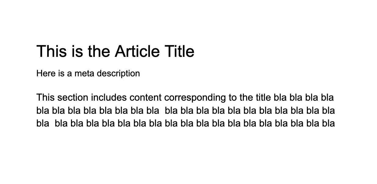
Font hierarchy is not all about small and big fonts. Additionally, it is about how the proper combination of sizes, colors, and weights produces contrast and makes the text look in a way that encourages people to read it. The bigger the contrast in your text, the better it will look.
Let us now see how you can create a better contrast similar to the one you see in the above image.
- In order to create hierarchy and contrast, make sure you do not use the same type of weight with different font sizes.
- You can make the primary content (title) bold and use a dark color to highlight its importance. In our example, we made the title ‘Golden Retriever’ bold and used a darker style.
- Meanwhile, you can go with a lighter color for secondary content and make it small. As per our example, we have kept the secondary text, i.e., the description of the Golden Retriever, which is small and lighter in color.
- Make sure to use different kinds of text colors, from darker to lighter, to make the text look appealing.

In the above example, we have moved from darker for the headline to lighter for secondary content from the base color.
- Opt for applying bigger font gaps to your items. The bigger the font gap, the better contrast your get in your content.
- One important thing to note is that Contrast = weight+size+color of text.
- To create a better font hierarchy, you can refer to the online calculator, Modularscale.
- Also, to check the contrast ratio you created, you will find a tool on the internet called Contrast Ratio.
2. Avoid Creating Multiple Shades of Black
It is not a good practice to create multiple shades of black on a white background by moving your color picker up and down.
Using the black text color (#000) creates strain on the eyes of readers. So, the best solution to this issue is to create darker variants of black as a substitute. Also, using the black color with different opacities is better than picking three or more hex color values.
You refer to the following image to understand how to use different opacities of black color.
In the above example, you can notice that we have used the primary color black (#000). The title has a maximum opacity of 85. Later, we decreased the opacity of the text color to 75, and for the meta title, it is 60.
3. Use Spacing to Separate Sections
Always using a generous amount of space between two groups sections is a better idea than using a line to show the separation. You can look at the following image to understand the importance of generous spacing.
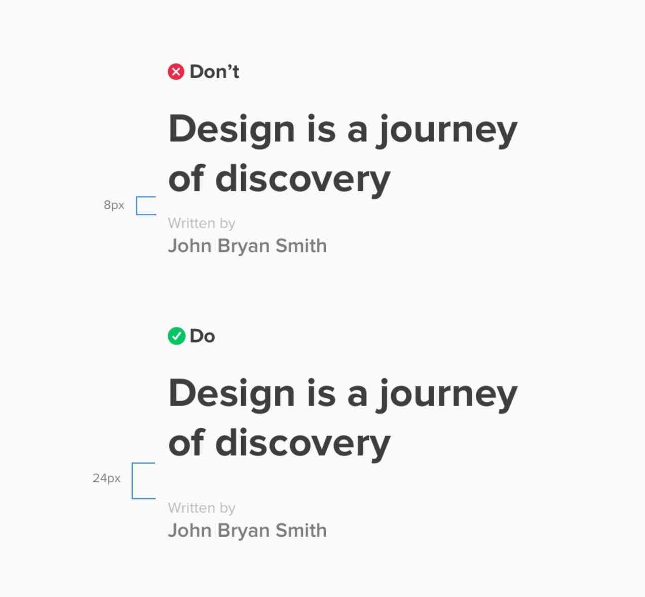
The law of proximity states:
“Objects that are near, or proximate to each other, tend to be grouped together."
In our example above, we have created a large space gap of 24 px between the book's name and its author so that readers do not miss out on the author’s name.
4. Separate Rows using Colors
Using colors for row separation is a great idea as it helps readers to distinguish between the rows easily. Rather than simply using lines, you can opt for adding a background color for rows. Not only do readers find it easy to read data in rows, but you will also find it enjoyable.
In the above example, you can observe we have created two tables. The first table leverages lines to separate rows, while the second one uses a background color on alternate rows. You will definitely find it easy to read the second table.
5. Multiply instead of Drop Shadow Text
When the image background is dynamic, i.e., it changes from time to time, adding text or design header components becomes pretty challenging.
The most typical solution for adding text over a dynamic background image is to leverage drop shadow. However, it is important to note that drop shadow does not enhance user readability. It adds more visual clutter around the words or letters to fill up the spaces between them.
It is ideal to use Multiply as a blend tool to fill the gradient. The following image highlights the specifications for Multiply blend options:
Using Multiply as a blend tool is much easier than creating black background over the image. The grayed scale of Multiply aids in retaining the original color of the other parts of the image. Meanwhile, it makes the part of the image a little bit darker where the text is located.
6. Line Length
It is not ideal to have a longer line length as it may make readers boring to read and creates a strain on their eyes. Designers often make the line length longer to fit the text in the container, which is not a good practice. An ideal line should contain 45 to 65 characters.
However, when you make the line length shorter, you will find that the page has a big white space on the right side, as shown in the following image:
There is a solution to this problem as well. You can make the entire text column center aligned to its container. Doing so removes the big white space on the right side. When you use the center-align feature for your text column, it will look like this:
So, don’t hesitate to shorten the line length just if you fear white spaces on the right side. Simply center-align your text, and all your problems get solved.
7. Avoid Reinventing the Wheel
When your UI design is not component-based, it looks inconsistent. An inconsistent UI design is something when you have 5 different kinds of card interfaces, multiple buttons, different heading title styles, and many other aspects.
Prior to designing an interface for any content, make sure to have a look at your previously designed interfaces. You may find a pattern similar to the one you want to create at present. Simply pick that design and create another card rather than reinventing the wheel. Doing this saves a significant amount of time and makes your design consistent.
In the above image, we created a card for ‘Company Art Group’ using the existing pattern on the left side.
8. Use Brand Colors as Accents
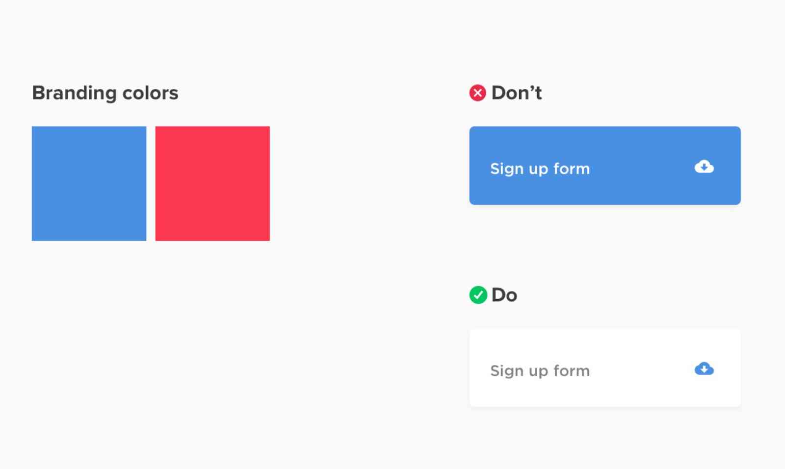
We typically assume that branding colors must take up a sizable portion of our interface colors. Our customers' stunning neon pink, orange, and yellow branding colors are difficult for us to include in our clean, minimalist structure. The response? Utilize them as accent hues.
9. Hang the Bullets
If you want to create a list design similar to the one in the above image, add the bullets, glyphs, or numbers to fit in the margin that represents the list. When you do this, user readability enhances as the content flows uninterruptedly.
10. Understanding Colors Using Maths
Whenever you see any design with a well-structured color palette, you might be thinking about how they did it or how they picked the right color combinations. However, understanding colors with addition and subtraction at Hue, Saturation, and Brightness (HSB) is pretty easy. Using this, you can create designs with better colors.
How Do the Addition and Subtraction in HSB Take Place?
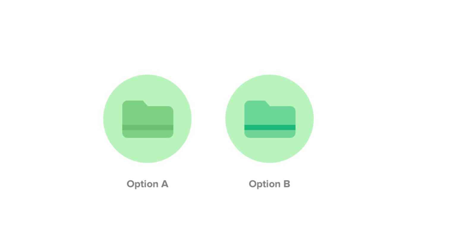
To understand colors, we have created two designs for representing a Folder. Both the options in the above image have the same base color, i.e., #B9F4BC for the circle background. Later, both designs differ when it comes to Folder and Strip. Before looking at both options, it is important to note that the first value corresponds to Hue, followed by Saturation and Brightness.
Option A
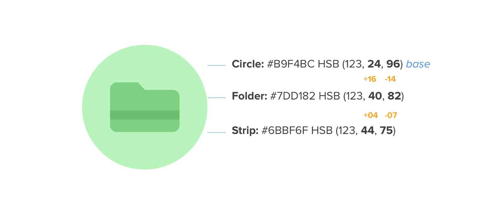
In Option A, we have kept the Hue value, i.e., 123, the same throughout the circle, folder, and strip. There is only the difference between the values of Saturation and Brightness.
Firstly, let us focus on the background, i.e., the circle, which has 24 as the Saturation value and 96 as the Brightness value. As we moved to the next shape, i.e., Folder, we increased the Saturation value to 40 and decreased the Brightness value to 82. Again, when we move to the Strip, the Saturation value increases by 4, i.e., it comes to 44, and the Brightness value decreases to 75 from 82.
From the above addition and subtraction between the Saturation and Brightness values, we can say that:
The change in the Saturation value, whether incremental or decremental, needs an inversely proportional change in the value of Brightness to create a good contrast in the design and vice-versa.
From the above statement, we can derive the formula:
Darker Value = Increment in Saturation is a decrement in Brightness.
Lighter Value = Decrement in Saturation is an increment in Brightness.
Option B
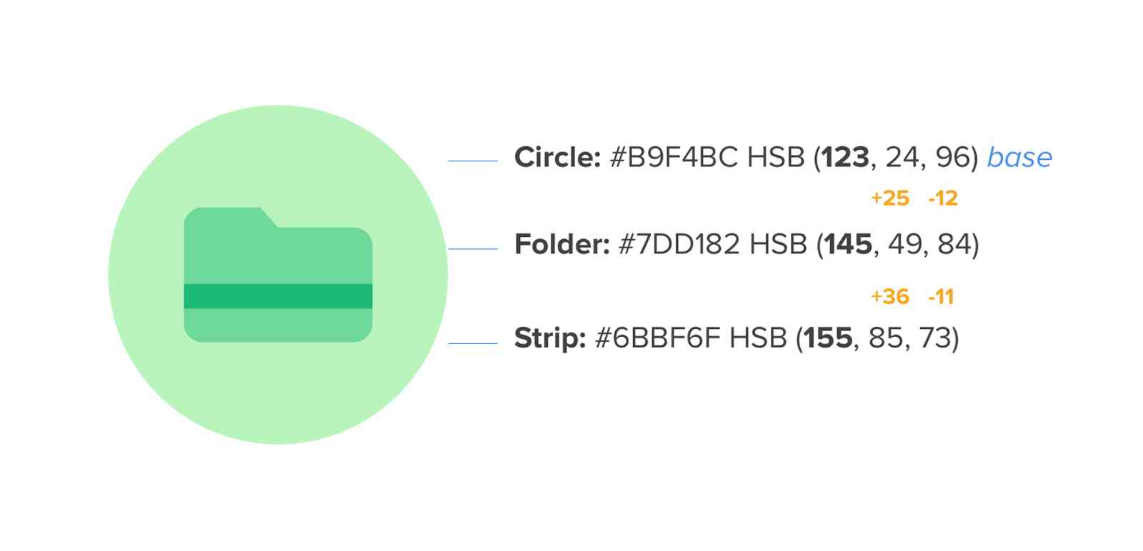
Now coming to Option B, the same formula we used above applies. However, the difference is that we also changed the Hue value in Option B.
Here comes into the picture the significance of RGB and CYN. While the acronym RGB is for Red, Green, and Blue, CMY is for Cyan, Magenta, and Yellow.
In the above example, we have kept the Hue value of the circle (background) the same as in Option A, i.e., 123. But, for the Folder shape, we have increased it to 145. This means that we have made the darker variation for the Hue of the Folder.
The base color is #B9F4BC (circle background). Now, we want a base color’s darker variation for the Folder icon. What you need to do is to move the color picker in the direction where the nearest RGB is located. In our example, it is blue, as shown in the image below.
This was for a darker variation. But what about a lighter variation? Don’t worry! It is simple too. Simply move your color picker to the left nearest to CMY, which is yellow in our case.
So, from the above discussion, we can conclude that:
Often RGB leads to a darker variation, and CYN leads to a lighter variation.
Once you are done with the color picker and achieve the desired variation, stick to the formula we derived in Option A to get the color combination as follows:

The following image depicts what hex values you need to use for different shapes, i.e., circle, folder, and strip.
“Red, Green, Blue (RGB) + Option A formula = Darker variation. Cyan, Magenta, Yellow (CMY) + Option A formula = Lighter variation"
Conclusion
Here we have reached the end of our list of cheat codes for designing user interfaces. Though there are many other cheat codes available, this article highlights the most significant and basic ones that every designer should consider while designing user interfaces. Using this UI/UX cheat sheet, you can surely create intuitive and good-looking UIs.
Happy Designing!
People are also reading:
- Creative Footer Design Tips for Website
- Creative Web Design Trends
- How to become a web developer?
- Guide to Web Development
- WordPress vs Web Development
- Web Development Technologies
- What is Web Designing?
- Backend Developer Skills
- Difference Between UI, UX, and Web Designer
- Top New CSS Features
Frequently Asked Questions
1. Who is responsible for creating a UI design?
A UI designer is responsible for working closely with the User Experience (UX) designer to create intuitive UIs that provide users with an amazing experience.
2. Do UI designers require coding?
No, UI designers do not require coding skills. However, basic familiarity with HTML/CSS and JavaScript would be advantageous.
3. What tools do UI designers use to create UIs?
Some popular tools among UI designers for creating UIs are Figma, Sketch, Adobe XD, Framer, Axure RP, UXPin, and Marvel.
